Collection update June ’17

SDC12365

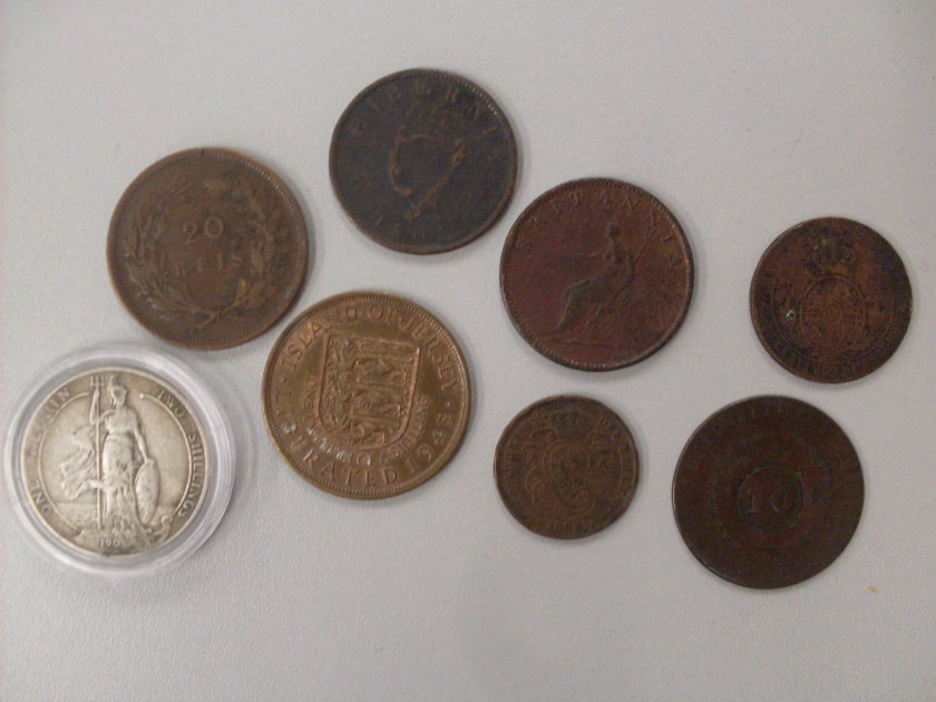
This month I managed to acquire a small smattering of 19th and early 20th century copper coins, with one silver 1904 florin.  The florin itself is interesting due to the fact it is the first design change of how Britannia was depicted on the coinage of Britain.  The usual design choice is with Britannia seated facing left, with her shield and trident by her side.  A image which can easily trace it’s roots back to Roman provincial strikes during their ~300 year occupation (The Royal Mint has a small page detailing more information about Britannia and the Romans.).  On the Florin of Edward VII we can clearly see she is standing facing right, with her customary trident and shield in hand.  This design was used until 1911 when it was changed to a pattern of crossed sceptres and shields depicting the coat of arms of the four constituant countries of the UK.

Keeping within the UK for a moment more we also have a bronze coin from the island of Jersey dated 1945, commemorating the liberation of the island from occupying German forces at the end of WWII.  Along with Guernsey and Alderney, the Channel Islands were the only part of the British Isles to be occupied by German forces during the war.  They were held from June 1940 till their peaceful liberation in May 1945.

SDC12366

To the top centre of the pictures there is a Hibernian penny dated 1805.  Unfortunately, the coin is badly worn, and the inscription, especially the portrait, of George III on the obverse is barely visible.  Hibernian coins were minted for the sole use in Ireland, and were minted after a 20 year gap due to the Napoleonic wars and the American War of Independence.  Minted in Soho, these coins were the first official issue of Irish coins in a base metal.  Most official coins being minted in precious metals such as silver.  This therefore caused a shortage of change (which was not just endemic to Ireland, but the UK as a whole at the time) leading to many ‘tokens’ being minted by locals throughout the country to fit this need.  These tokens were known as Evasion Tokens, and will be the topic of my next blog entry.

Finally, the last coin worth talking about, is the Brazillian 20 reis coin which has been counterstamped in the bottom right corner of the pictures.  Even though it is severely worn, the coin dates from the mid-1830’s when the Empire of Brazil was suffering from a series of revolts, uprisings and civil unrest.  Brazil at this time was under the control of Pedro II, the son of Pedro I who returned to Portugal to install his daughter on the throne.  Brazil was therefore ruled by a weak regency council as Pedro II was underageat the time.  The unrest began due to several wars with neighbours, but the straw which broke the camels back in regards to the currency could either have been the Cabanagem or the Malê Revolt.  Regardless, the currency was devalued in an attempt to save the country’s finances, and to save costs by not reissuing a new currency, the government simply cut the value of the coins in half.  So a 20 reis coin became a 10, and a 40 reis coin became a 20 and so on.  The new value of the coin was the counterstamp clearly seen in the middle of the reverse over the original value.  I do own several Brazillian coins with these counterstamps, but there are surviving types of this coin which do not bear the counterstamp, unfortunately I have only had the privilege of seeing them in pictures only.

Collection update May ’17

This month I will be talking about two small coins which I got as part of a small group of silver coins mainly from Denmark.  The Danish coins themselves date from the early 20th century, and like most Scandinavian coins of that era, their design, in my own personal opinion are something to be desired.  Generally sporting the value of the coin itself whilst displaying the monogram of the current monarch.  A bit lacklustre.  The second coin I want to talk about can easily fit into this category, as the design on the reverse is nothing to write home about, but the bust of the monarch is rather interesting to say the least.  However, I will move on to the first coin, as it has a bit more history attached to it.

imgonline-com-ua-twotoone-jkFhueRz2vhIj

Now above is a small silver coin from the city of Hamburg dated 1738.  It is about 17mm in diameter and about 1mm thick.  On the obverse we see the three towered castle which is the coat of arms of the city, whilst on the reverse is the date and value between some branches.  Sadly, sometime during it’s life the coin has been pierced to be worn as jewellery, thankfully it hasn’t marred much of the designs on both sides of the coin.  Even if it does leave a large ugly hole staring glaringly at you.
Hamburg itself is in a unique position within Germany, occupying an area in the north of Germany at the southern point of the Jutland peninsular. The full name of the city is the ‘Free and Hanseatic City of Hamburg’, tipping its hat to it’s medieval past and links to the Hanseatic trade league that it was a member of.  For much of Hamburgs existance it was a free city within the Holy Roman Empire, and later German Empire, being a state in it’s own right.  During the middle ages, Hamburg was one of the improtant ports within Europe due to it’s location near the North and Baltic seas, as well as being on the confluence of the rivers Elbe, Alster and Bille.  This was further strengthed by it’s status as a free city.  It was not, in fact, until after the Second World War that Hamburg lost it’s total independence from Germany itself as it was subsumed into the administration of Western Germany during British Occupation in 1949.  Where to this day it has grown to be the second largest city in Germany.

The second coin I mentioned is a silver threepence from the UK from 1819.  Now as I mentioned previously, the design of the coin itself is rather dull, but really I want to talk about the bust of George III displayed.

SDC12314

Now although the coin itself is very worn, and suffering from deep scratches on the face, a clear outline of the bust can be seen.  This bust design is known to collectors as the ‘bull-headed George’.  This was due to the engraver at the time, the Italian Benedetto Pistrucci, being unable to engrave a proper portrait from life due to George being very much insane. This portrait was thus put into use for several years between 1816-1820, and was met with much public hostility from all sectors of society.  One high ranking official in the Houses of Parliament has even been noted to have said ‘send the lot to the provinces so no-one has to see them’.  By this he meant the anywhere that wasn’t London or the south of England.  A view which is still often in use today.  Eventually the design was withdrawn from use, and the mint reverted back to the older ‘Young head’ design of the late 18th century, much to many peoples relief.  George was succeeded by his son George IV in 1820.

The new £1 coin

Now although it has been nearly a month since its general release, I have finally managed to acquire one of the new pound coins that doesn’t look like it has been dragged through a muddy field (I mean it has just been under a month…how do people manage to get them so dirty so quickly?).  So anyway, the design on the reverse is of the principle ‘flowers’ which represent each principle country of the UK.  You have the rose for England, the thistle for Scotland, the leek for Wales, and the shamrock for N. Ireland.  A winning design picked from a group selected by the Royal Mint.  I did hear on the grapevine somewhere that one of the chief entries for consideration for the new coin was to put something iconic of Britain on there, and someone came up with a full English breakfast.  The fact this was seriously considered did not fill my heart with confidence.  Thankfully they chose something a bit more sensible, if somewhat boring.

imgonline-com-ua-twotoone-tAjtp21G7SEl

So the new pound is radically different to the old ones.  It is somewhat larger, thinner and sports a new shape reminiscent of the old three pence piece the UK had prior to decimalisation in 1971.  It is also made up of two contrasting metals with a nickel-brass outer ring and a cupro-nickel core, making it very similar to the current circulating £2 coin, and a slight imitation to the 1 euro coin.  So the big question is, why the radical change? Why now, after the last major change to the UK currency was back in the late 90’s with the introduction of the £2 coin.

The simple answer is… just to combat fraud.  The pound coin is one of the most forged coins in British circulation, with the Royal Mint estimating that 1 in every 8 pound coins is fake.  So with the radical change in the coins composition and design other security features have also been added.  As well as the new shape, the usual ridged edge has also been included in the design.  As well as a semi-holographic area underneath the Queen’s portrait on the front (which I am told is also the 6th current portrait of her, and the new pound is the first coin to utilise it) which switches between the number one and the pound symbol.  Along the edges in fine writing there is script, which I didn’t notice until I inspected the coin with a jewellers loupe.  I personally thought it was just random bumps as decoration.  Either way, on the obverse the small script says the value of the coin, whilst on the back it shows the date.  There is a final hidden security feature which hasn’t been told to the general public (I am sure we will all find out sooner or later), which allows any authority to instantly check to see if the coin is legitimate or not.

As for my own personal opinion I am still a bit ambivalent about the coin.  As a collector I love seeing new stuff and witnessing big changes in a country’s coinage.  However, I feel a little bit sad as the old design will be phased out by the end of the year and it is something I have always known and grown up with.  I guess right now I am going through what everyone does when something new comes along and changes things.  I am sure the new pound will grow on me, and I will continue looking forward to the revealing of new designs on future strikes.  As long as it’s not a bloody full English breakfast…